In this tutorial, we’re going to be learning how to build out a flip card using html and CSS.
Prerequisites
This tutorial assumes basic knowledge of HTML and CSS: including topics such as flexbox, CSS pseudo selectors and how to properly layout elements using CSS.
This tutorial is not for absolute beginners, and as such, will not explain every basic concept.
Before we start, I will like to explain the step-by-step process we’re going to follow in order to build out this flip card. So that you would know what to expect and have an idea of what we are doing even as we build along.
How this Flip Card will be built
- Firstly, we’re going to create a container that is going to represent our flip card.
- In the container we’ve just created, we’re going to create another container that is going to have the front side and the back side of the card (this is also going to be the container that rotates/flips).
- In the container we’ve just created in step 2, we’re going to place two containers in it: one would be for the front side while the other would be for the back side of the flip card.
- The next thing we’re going to do, is to properly align the front side and the back side of the flip card, then rotate the backside, in order to place the content properly whenever the card flips.
- Then finally, we would apply the rotation.
Let’s begin…
Create the Flip Card container
<!DOCTYPE html>
<html lang="en">
  <head>
    <meta charset="UTF-8" />
    <meta http-equiv="X-UA-Compatible" content="IE=edge" />
    <meta name="viewport" content="width=device-width, initial-scale=1.0" />
    <link rel="stylesheet" href="style.css" />
    <title>Flip Card</title>
  </head>
  <body>
    <div class="flip-card"></div>
  </body>
</html>
Create the both sides of the Flip Card
To create the both sides of the flip card, we must first create a container to hold them:
<!DOCTYPE html>
<html lang="en">
  <head>
    <meta charset="UTF-8" />
    <meta http-equiv="X-UA-Compatible" content="IE=edge" />
    <meta name="viewport" content="width=device-width, initial-scale=1.0" />
    <link rel="stylesheet" href="style.css" />
    <title>Flip Card</title>
  </head>
  <body>
    <div class="flip-card">
      <div class="flip-card-inner"></div>
    </div>
  </body>
</html>
Now we can place the both sides of the flip card in the div we’ve just created.
<!DOCTYPE html>
<html lang="en">
  <head>
    <meta charset="UTF-8" />
    <meta http-equiv="X-UA-Compatible" content="IE=edge" />
    <meta name="viewport" content="width=device-width, initial-scale=1.0" />
    <link rel="stylesheet" href="style.css" />
    <title>Flip Card</title>
  </head>
  <body>
    <div class="flip-card">
      <div class="flip-card-inner">
        <div class="flip-card-front"></div>
        <div class="flip-card-back"></div>
      </div>
    </div>
  </body>
</html>
Add some content on both sides of the card
<!DOCTYPE html>
<html lang="en">
  <head>
    <meta charset="UTF-8" />
    <meta http-equiv="X-UA-Compatible" content="IE=edge" />
    <meta name="viewport" content="width=device-width, initial-scale=1.0" />
    <link rel="stylesheet" href="style.css" />
    <title>Flip Card</title>
  </head>
  <body>
    <div class="flip-card">
      <div class="flip-card-inner">
        <div class="flip-card-front">
          <h1>This is the front side</h1>
        </div>
        <div class="flip-card-back">
          <h1>This is the back side</h1>
        </div>
      </div>
    </div>
  </body>
</html>
What we did here, was to add some content to differentiate between the front side and the back side of the flip card.
Align the both sides of the Flip Card
At this point, we are going to be writing some CSS. Copy the following CSS to your CSS file to apply the recommended styles:
* {
  padding: 0%;
  margin: 0%;
  box-sizing: border-box;
}
body {
  height: 100vh;
  width: 100vw;
  display: flex;
  justify-content: center;
  align-items: center;
}
.flip-card {
  height: 300px;
  width: 300px;
  border: 1px solid black;
}
.flip-card-inner {
  height: 100%;
  position: relative;
}
.flip-card-front,
.flip-card-back {
  width: 100%;
  position: absolute;
  text-align: center;
}
The above CSS will not only align the both sides of the card, but will also add a little extra styles to our html page to ensure things look a little nicer.
Here is what we have now:
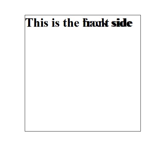 And it doesn’t look really nice. This is because what we did was to place one side of the card on top of the other. This is how the card is meant to look for now, and as we progress, it will look better.
Align the back side of the card
So the next thing we need to do, is to properly align the back side of the card.
In order to do this, we need to rotate the back side of the card. We are doing this because, the back side of the card is meant to be a reverse image of what we have on the front side. If we do not rotate the back side of the card, when the card is flipped, the text on the back side will not be properly displayed.
Add the following style to the back side:
.flip-card-back {
  transform: rotateY(180deg);
}
Learn more about the transform property
Now this is what we have:
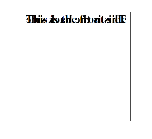
And it still doesn’t look nice, but we’re getting there.
Apply rotation on hover
The next thing we need to do, is to apply our rotation. To achieve this, add the following styles:
.flip-card-inner {
  transition: transform 0.6s;
}
.flip-card:hover .flip-card-inner {
  transform: rotateY(180deg);
}
Hide backface-visibility
If you’ve done everything correctly to this point, you’d notice that the card still doesn’t display properly, and even after the card is flipped, the text is still not properly displayed on either side of the card. This is because we haven’t hidden the backface-visibility of each side of the card. Here’s how we can hide them:
.flip-card-front,
.flip-card-back {
  backface-visibility: hidden;
}
Learn about the backface-visibility property
Preserve the 3d view after rotation
Now if you check, you’d notice that we’re almost there. The only remaining problem, is the fact that after the card has been flipped, the back side of the card is a mirror image of what it is supposed to be. This is how you fix it:
.flip-card-inner {
  transform-style: preserve-3d;
}
The default value for the above CSS property is “flat”. This is what makes the back side of the card to look the way it did. We don’t want the value to be set to flat by default, so we changed it to be “preserve-3d” instead. Learn about the transform-style property.
Add the above styles to your CSS and you’ll be good to go.
Add Perspective
The final thing we need to add is the perspective.
What the perspective property does, is to allow you set the distance between you (the viewer) and the card. The smaller the value, the closer the card would be; and the greater the value, the farther the card would be.
.flip-card {
  perspective: 1000px;
}
The perspective property is just a way of representing 3d objects on 2d planes. By including it, the 3d effect on the card is further enhanced.
And that’s it! You have a flip card now.